Danubian Dreams
Bratislava
Exhibition: June - July, 2006
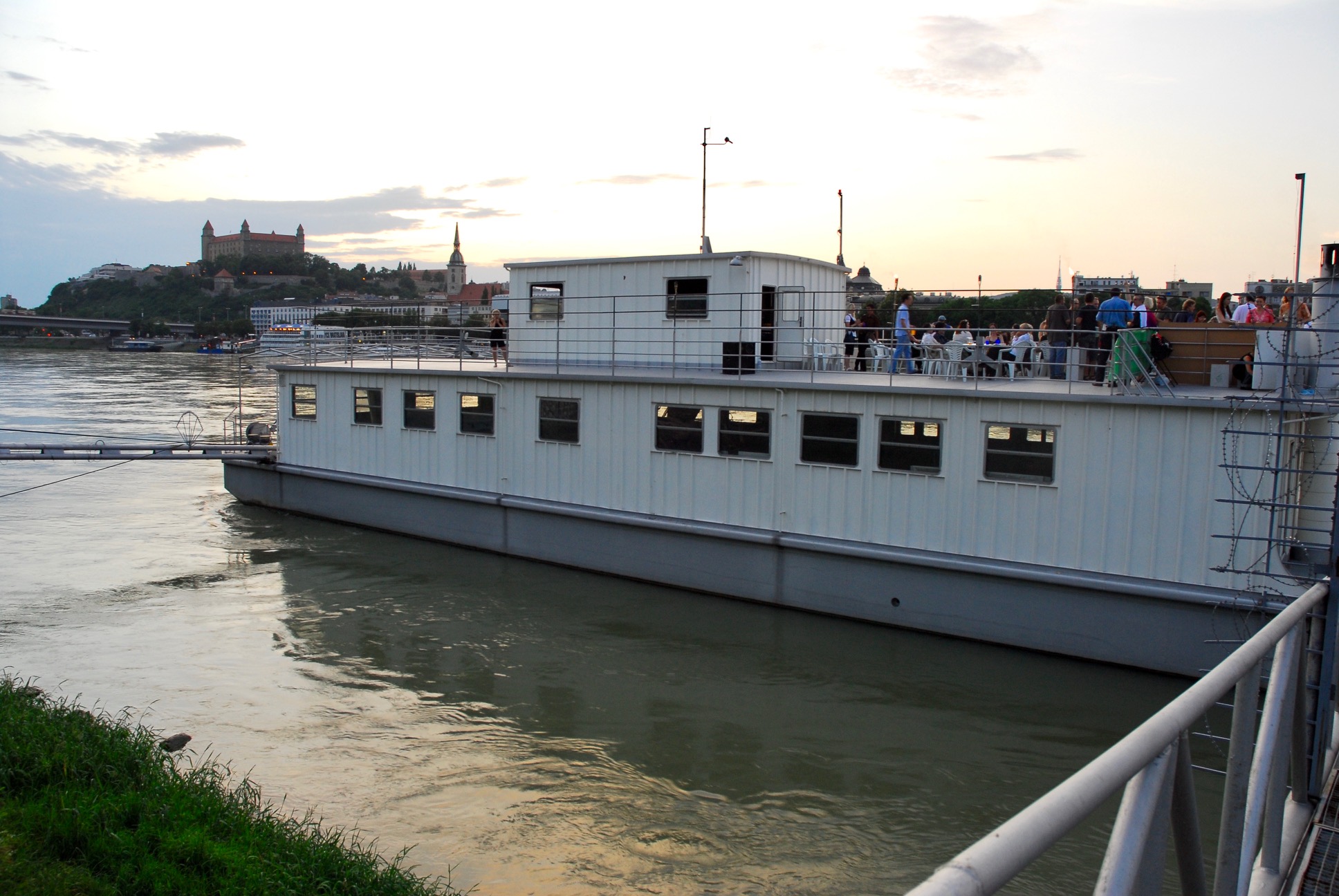
Magio pláž, Bratislava, SK
Danubian Dreams gathers five European architects and designers: Odile Decq(F), Peter Cook(GB), Matali Crasset(F), Medusa Group(PL), Helen & Hard(NO) and Vallo & Sadovsky(SK) who were invited to create their own "shed". This project re-questions the idea of the hut as the first habitat and re-proposes this notion to live in the 21st century.
These constructions will travel through Europe: at first, they will be installed and exhibited on the banks of the Danube in Bratislava, the capital of one of the new members of the European union, Slovakia. Other locations will be Budapest,Belgrade and The black sea coast (the Danube Delta) with others architects. This project was made possible with specific guidelines: the size of the sheds (of 5 to 10m2) and their mobile character that allows than to travel throughout Europe (each shed is made of dismountable and transportable elements that can be carried by two people). The guidelines also strongly advocated the use of renewable energies and recyclable materials.
The new aspect of this project is that for the first time, a gallery proposes to obtain an architectural realization, not a model or an installation but a true hut by an architect. Each shed will be editioned in 8 copies and will offer a new place to live, to isolate oneself or to dream.
Initiated by Nadine Gandy Danubian Dreams distinguishes itself by the diversity of variations on the theme of the shed, and the meeting of architecture, contemporary art and design in a project out of the ordinary.
A book will be published in conjunction with Danubian Dreams and a series of conferences will be attended by the participating architects and designer.
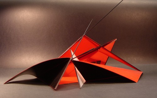
Odile Decq (France) - Project : "OPEN TIPI"
"My project is a tipi. It is opened - not a cocoon; it communicates and opens to the surrounding world".
The elements that compose its partitions can take different configurations and also reorganize the space to transparent, while stripping the leaves off itself it gives itself space and opens this one to the exterior one. Simple, technological and recyclable. It can be manufactured very simply:
- the perches will be on aluminum or on carbon fiber
- the elements partitions can be simple textile, or plastic one, of canvas of covers that has tarp, of felts, etc…
- certain partitions will be done several beds of materials.
Born in 1955, France In 1996, the agency Odile Decq and Benoît Cornette obtained the LION D'OR at the biennial of architecture in Venezia.
Three projects appear as founders of the agency: the seat of the Popular Bank of the west (Rennes), then the installation "Hypertension" in Grenoble, and the project of the pub Renault for the Champs Elysées in Paris. The project of Odile Decq was kept for the Macro (Museum of contemporary art) in Rome that is currently in construction course. Multiples projects are in realization course: residence and commerces in Florence, Museum for the Collection Liaunig (Austria), FRAC Brittany…
Since 1992 Odile Decq is Professor in Special School of architecture in Paris.
Peter Cook (United Kingdom) - Project: "HAT AND COAT KIOSK"
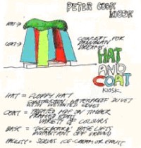
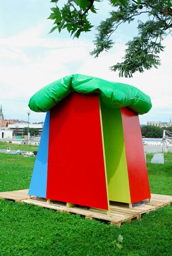
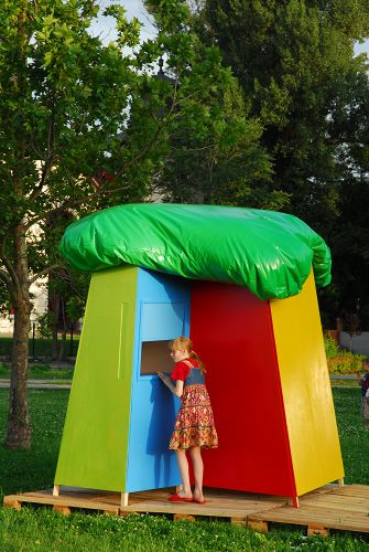
Peter Cook proposes to install different colored kiosks by the Danube called "Hat and Coat" for there to sell ice creams or fruits. The roof (Hat) is composed from a comforter waterproof to the ballasted edges. The partitions (coat) in MDF treated (fibers of average density) on wood, framed edges with a big variety of colors. A basis in "caillebotis" separates the kiosk of the ground.
Peter Cook is born in 1936, United Kingdom, he lives and works in London.
He is the co-editor of the magazine "Archigram" that influenced a generation of architects.
It essentially published manuscripts on the theory of the architecture Spacelab (Peter Cook with Colin Fournier) realized the Museum of modern art of Graz in Austria. Peter Cook is currently instructor at the Bartlett school of architecture, university college London.
Matali Crasset (France) - Project: "KLOROFIL"
Klorofil is conceived as a platform that provides new ways of viewing the world. The structure consists of 4 raised seating units linked together in the shape of a belvedere that is integrated to the surrounding landscape.
Klorofil is about: Taking over time to appreciate nature and open new windows to view the world / Disconnecting from reality and at the same time sharing moments where time is suspended / Enjoying looking at starry skies at night as you sip decoctions of herbal tea. And when you feel really tired, or if you want to take a short nap for a couple of hours, Klorofil offers the ideal conditions for resting outside your home and waking up to the rising sun. Klorofil provides a different experience for the family, another insight into the world that you can enjoy just outside your home. Klorofil is a tool of transmission and sensibilisation through which you experience new and exciting adventures. With Klorofil, you can look at stars, examine birds during the mating season, and follow nature‘s development over the course of each season. A comfort that brings out essential values and fosters the sharing of new sensations.
Born in 1955, France. Collaborator of Denis Santachiara and Philippe Starck, the designer Matali Crasset creates her own company "matali crasset production" in 1998. 2002 and 2003 are rich years in expositions, of which were retrospective ones to the Victoria and Albert Museum in London. To the same era, Matali Crasset acts in scÈnographe for the Hi Hotel of Nice and draws the body of the furniture and most of the objects that define the space. For 2006, Matali prepares a personal exhibition at the National cooper-hewitt Museum of Design New York. The designer has just conceived the installation of a museum in the Netherlands it "SM's" and was elected "Creator of the year" by the Parlor of the Paris furnishing.
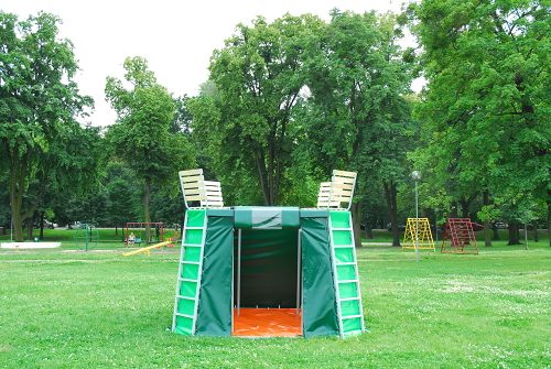
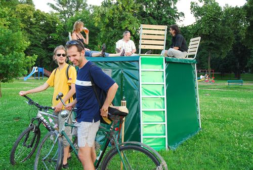
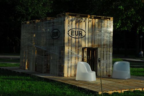
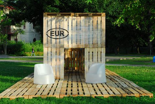
Medusa Group (Poland) - Project: "EUR SHED"
EUR Shed is an answer of how we imagine contemporary pavilion corresponding to the universal context.
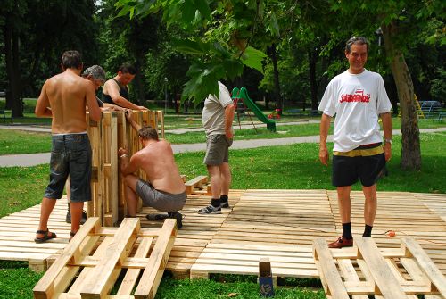
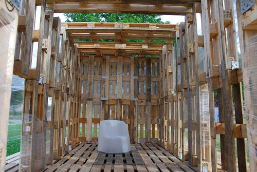
We tried to find out what is the universal context for the modern shed and what we got was the lack of context. But in some way lack of context is still a context. The context of uniformed and global world obsessed by consumption, transport and market. The EUR Shed is referring to those factors. We did use the uniform transportation palette as the repetitive basic element of the pavilion and the common plastic band used in shipping goods. This element is a part of mentioned above global context. Its an icon of the transport era and is easy recognizable in almost every country. Thus the EUR Shed fits different locations and due to its uniform character could be applied to any context. At the same time it represents also the most important for us features in designing space : its cheap, easy to install, flexible and recyclable. It could be easily mounted by two people, and the construction materials could be bought at the destination place and than could be sold after deconstruction without big loss of value. In a sense the transport of the shed is more transporting the user manual and the know-how than transporting real construction materials.
This is also an open project that leaves a margin for individual modification concerning the shape, cover, roof protection and the flooring. The presented version is more a design manifesto representing our approach to designing than a real specified functional object.
design and text: medusagroup
Young Polish agency created by Pzermo Lukasik and Lugasz Zagala.
After a passage in Paris in the agency Nouvel and the one of Odile Decq and Benoît Cornette, Medusa Group installs itself in SilÈsie (Poland) and realizes their Kolko Loft, "a house of manifest". They obtain the Grand Prix award for the better building of Silésie in 2003 for the modernization and enlargement of the Wasko headquarters. Their Kolko Loft and their single-family house are nominated for the prestigious price Mies Vans der Rohe in 2004.
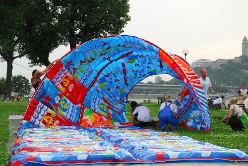
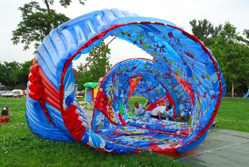
Helen & Hard (Norway and Austria) - Project: "AIR FORCE TAKE AWAY"
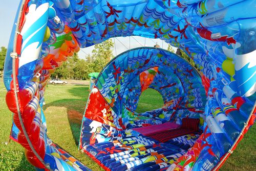
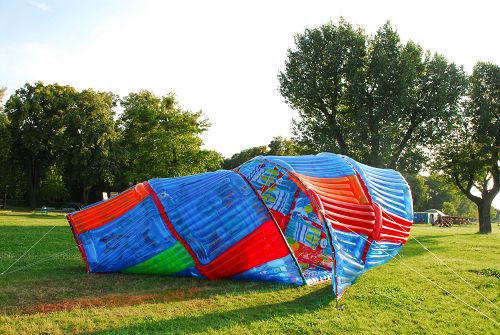
Technical equipment, space games, more intimate spaces, of expression, of relaxation…) are linked to the rug to the assistance of zips, scratches or of pockets, they are constituted to some sandwich like do a box that is surrounded by parts and of other by a solid board "tech-wood". The "techwood" is completely recyclable, it is constituted to 70% of wood fibers encapsulated in a resin thermoplastic. © Images are courtesy of Gandy gallery, Bratislava. The project of Helen and Hard is done with two different methods of nomadic spatialisation: to occupy the territory with a rug and personalize this territory with our own goods and personal objects. - The rug can be unfolded on the ground or on the water. It is inflatable, lucid and interactive made of EFTE (EthyleneTetraFluorEthylene). This material is ecological and for practically completely recyclable, it possesses insulation qualities thermal, phonic, of luminous transmission. - The goods are more personal, more flexible and lighter, (arrangements, movable, technical equipment, space games, more intimate spaces, of expression, of relaxation…) are linked to the rug to the assistance of zips, scratches or of pockets, they are constituted to some sandwich like do a box that is surrounded by parts and of other by a solid board "tech-wood". The "techwood" is completely recyclable, it is constituted to 70% of wood fibers encapsulated in a resin thermoplastic.
The Helen & Hard agency was created in 1996 to Stavanger in Norway by Siv Helene Stangeland (been born in 1966 in Norway) and Reinhard Kropf (been born in 1967 in Austria). The Helen & Hard agency presents a very creative work all while retaining impregnated traditions (wood), feelings (the nature), usages (the social exchanges, the communautarisme), and of the imperative contemporary one nordic countries: to obtain the light and the landscape, look for the balance between the ecology and the invention of the forms. Their realizations recently were presented in the architecture Gallery of Paris. The construction the more known today is the one of two houses in the historic center of Stavanger. Stavanger will be in 2008 the one of the two European capitals of the culture with the British city Liverpool.
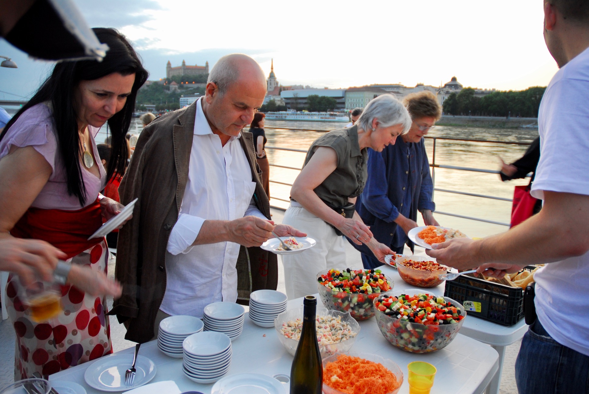
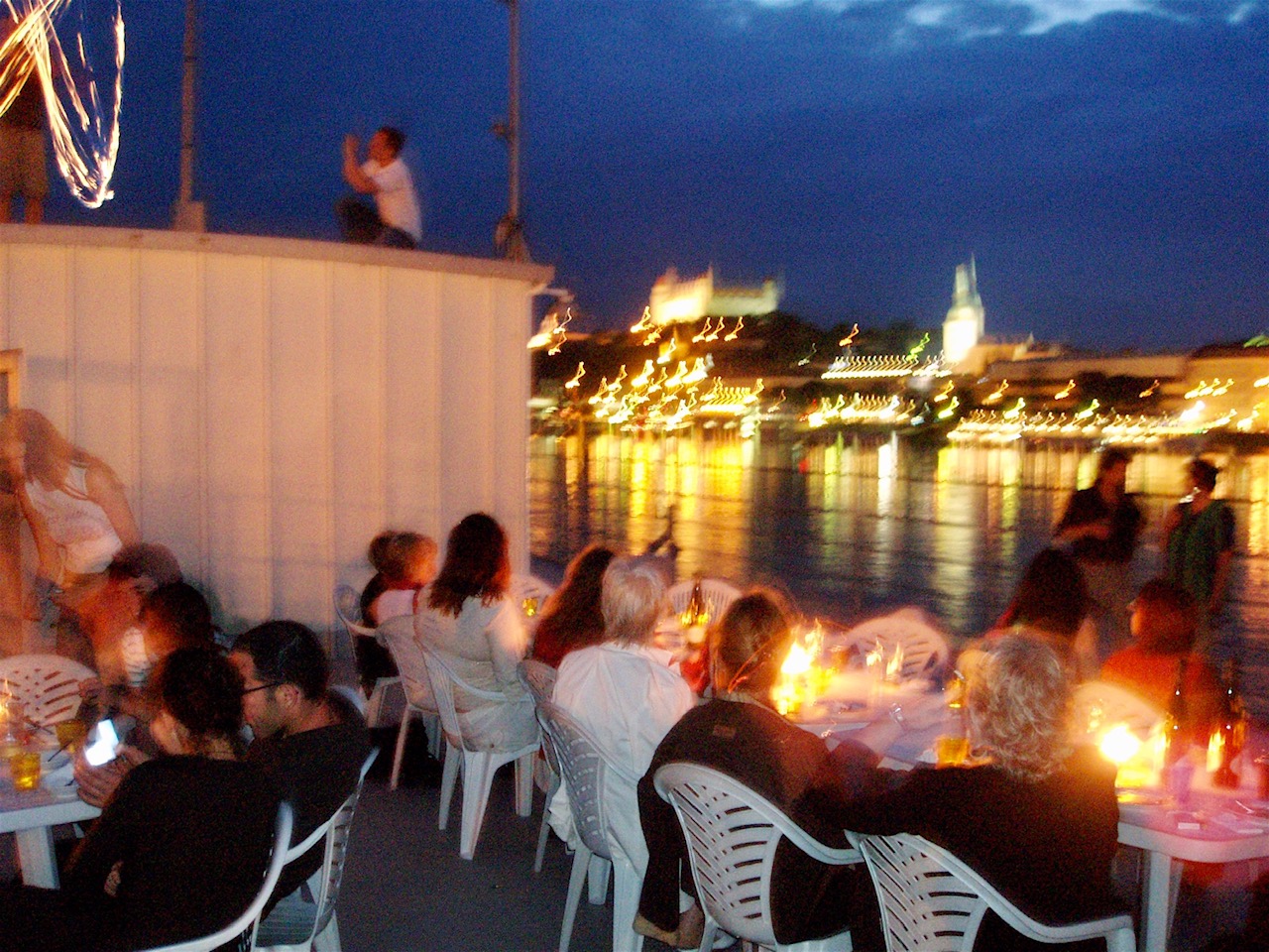
Opening
![]() Deidi von Schaewen
Deidi von Schaewen
FROM THE PRESS:
Skyblue: River of Dreams (PDF)
AD 07.07: Apologie de la légèreté (PDF)
Der Standard (JPG)
PUBLICATION:

Danubian Dreams
Publisher: Gandy gallery, 2006
21 x 21cm, 22pp
English
Photography: Deidi von Schaewen
Graphic Design: Boris Melus
